HOWTO: Graph your GPG keyring
We had a keysigning party at work today, and after it finished a few of us were looking for a way to visualize the newly increased signature density. It turns out the best tool for the job is called sig2dot, which is available in the Debian repositories (and as a Perl script on its homepage).
Just make sure your keychain is refreshed with the most up-to-date keys (that’s just gpg --refresh-keys), and then run the script to create a file in the DOT language. I had to download the script itself, so I ran:
$ gpg --list-sigs | ./sig2dot.pl > keyring.dot
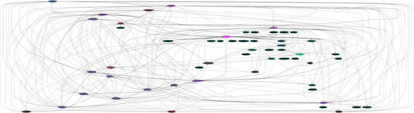
Then, you can use one of a number of programs to render a visual file out of keyring.dot. If you have the package graphviz installed, you can use its dot command, or the neato command, which behave differently. Here are examples from my own key ring of the two programs in action:
$ dot -Tpng keyring.dot > keyring.dot.png
$ neato -Tpng keyring.dot > keyring.neato.png
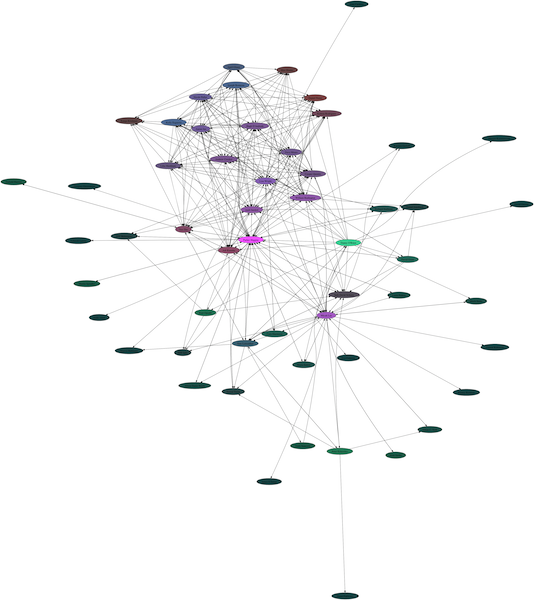
In both cases, I’ve reduced the size of the graph a lot intentionally so the names are unreadable, but I’m looking at them locally at full size. In each case I’m the bright pink node in the middle. In the second graph, the keysigning party is clear as the dense patch in the top.