How does Fraktur degrade across platforms?
The Unicode Consortium, in its ∞ wisdom, decided a long time ago that the Fraktur script—that weird old-fashioned German style of text—should not be encoded in its own block, but rather considered a font in which standard latin text can be rendered. That has some implications for ligatures, but that’s beyond the scope of this post and my knowledge.
However, most of the Fraktur alphabet is available deep in the math characters code points. Using a simple conversion tool, like this text converter I keep bookmarked, you can replace standard characters with those math symbols that resemble them. By doing that, you can copy and paste what looks like formatted text into plain text boxes, and—for example—make jokes with it on Twitter.
Which raises the question of how various platforms support it, and how that support degrades. After all, we’re talking about pretty deep recesses of the Unicode character space, so it can vary pretty wildly.
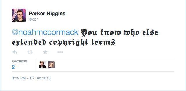
Earlier tonight I made a joke on Twitter to my friend Noah that used these characters. Here’s how it appeared on my OS X box running Firefox:

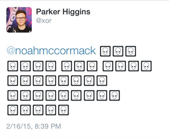
But here’s how it looked to him on his iPhone:

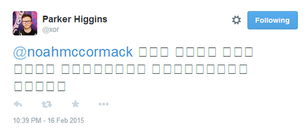
I wanted to see how it appears on different platforms, so I asked people to send me screenshots, and got a whole bunch of responses. On multiple versions of Windows and different platforms, you get empty boxes:

While on Android, across many different apps, it degrades to the plain latin text!

I also got evidence that it worked fine on a range of GNU/Linux boxes, every OS X combination I saw, and a Chromebook.
The frustrating result is that not only can you not count on all popular platforms to support these characters, you also can’t count on them to fail the same way. Android removes the context that these are “special” characters, while iOS, Windows, (and, incidentally, Sailfish OS) render it completely unreadable.
So I guess don’t use it for mission-critical Twitter jokes.
P.S. If you’ve read this far about Fraktur, you really ought to read about the Antiqua-Fraktur dispute, which is an amazing piece of typographic history.