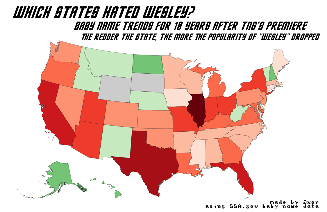
Which states hated Wesley?
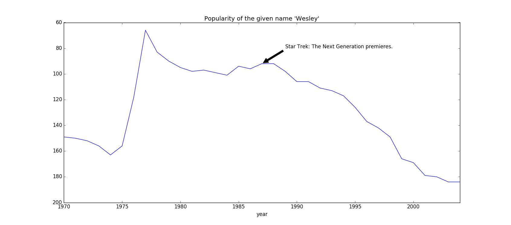
One of my goals while at Recurse Center has been to improve my ability to manipulate and visualize data sets. To that end, I’ve been toying around with the Social Security Administration’s baby name dataset, which records the number of babies born with each given name every year, both federally and at the state level. Because I’ve also been watching Star Trek: The Next Generation along with the Treks And The City podcast, I chose to dig into information about the name “Wesley.”
On my first pass through the data I noticed that the name’s popularity dramatically spiked around 1976, and then tapered off for a few decades after. Honestly, that spike is the most interesting property of the whole graph, and I can’t explain it very well. But a funny secondary effect is that neither TNG‘s premiere nor the release of The Princess Bride—both in 1987—could prop up the name as it declined in popularity. The effect makes it look like it’s tumbling off a cliff, instead of regressing to the mean. This graph, including the label, was generated in Python’s matplotlib.
After looking at the federal data, I decided to dig into the state-level stuff, to give me a (long-anticipated!) opportunity to generate a choropleth map. Again, I cleaned up the data in Python, and then generated a map using a Javascript library called <a href="https://d3-geomap.github.io/">d3-geomap</a>. For a long time I’ve wanted to get more familiar with its parent library, d3, and this has been a nice opportunity to dip my toe into that.