A new website for Malaika, tracking crossword publications
A few weeks ago, my friend Malaika Handa nerd-sniped me with an interesting request. She is a very prolific crossword constructor (think: multiple publications a week) and she keeps comprehensive records of those publications in a spreadsheet that is always up to date.1 She wanted a site to display that history in a clean and browsable way.
I built her that site, and we published it yesterday. I’m really proud of how it turned out, and want to share some thoughts about how it came together.
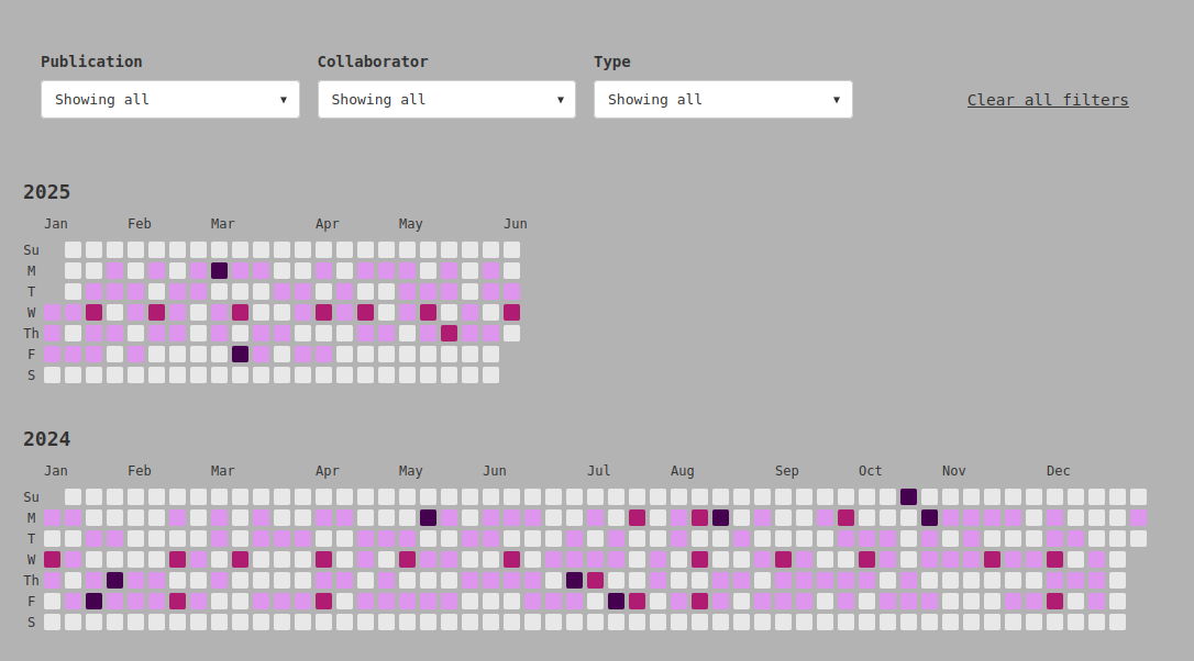
Programmers in the audience will likely recognize the inspiration immediately. She wanted to display her data in the style of GitHub’s “contributions calendar,” which is displayed by default on every user’s profile. (See my profile, for an example.)
That chart displays days as cells in a 7x53 grid, and colors each cell in a shade of green that depends on how many “contributions” the user made on that day. As a format for visualizing software development data, it has been wildly influential, and that influence has come with lots of backlash. It’s kind of a classic GitHub issue: something they thought was a straightforward measure of some objective metric turned out to be deeply opinionated, and even political, in terms of the values it promotes and actions it encourages. Ah, well.
Some of the criticism boils down to its flattening tendency. By first creating a limited definition of a “contribution,” and then equating all of them in a quantity-only measure, it strips the character of some contributions and outright ignores others. (I can pretend to be above it, but this project began life as a major pull request before being split out into its own repo. The commits for the former were not shown on my graph, and I was annoyed!)
Part of our design spec aimed to avoid that flattening. We wanted to create a customizable set of rules for cell colors, beyond just buckets of counts: Being able to visually distinguish days with entries in a certain category — such as “full-size” 15×15 puzzles — was much more important to us than highlighting days with two or three puzzles published.
The means that, despite the visual similarity, our implementation diverged meaningfully from the inspiration. The general term for the kind of chart GitHub makes is a “calendar heatmap,” and there are some robust libraries for creating them. But given that divergence, and because it would be more fun to build this from scratch, I didn’t use any of them. Instead, the calendar is rendered with a dependency-free vanilla javascript module.
In fact, the first version was one big blob of javascript that did everything by itself. When I shared it with some other folks at the Recurse Center, I got the good feedback that it might be fun to generalize a bit for possible reuse. (I got maybe halfway there in time for launch.) I did realize that moving more configuration from hardcoded properties to initialization parameters would make it easier for Malaika to update and change it in the future, so the calendar, the details panel, and the filters are each separately defined and given specifications in the page’s script tag. Those specifications include the coloring rules, the format of the tooltip presentation, the columns to filter by, that kind of thing.
That pattern of moving configuration up a level of abstraction is one I repeated throughout the development, and eventually I moved a bunch of parameters into a repo-level configuration file. The text on the page, the site’s metadata, and even the theme colors are defined in one file, so she can make updates without having to get into the weeds of the site. Once I’d done that, I was able to ship a bunch of little quality-of-life improvements: the site’s favicon and Open Graph image are generated at build time using the theme colors, for example.
Keen-eyed readers may have put together that Malaika is the “sophisticated programmer” I mentioned in my post last week about Google Sheets as a database. The source of truth for the site is a Sheet she has kept updated for years, which she maintains with a combination of manual data entry and Apps Script automation. Every few hours, a GitHub Action pulls the live data from the sheet, commits if there have been any changes, and then kicks off a new site build. GitHub Actions are famously sort of finicky, and I ran into an issue with chaining workflows, but otherwise it was pretty smooth sailing.
What she didn’t realize when she mentioned the project to me was that this format was a little personal. Years ago, before I had started my programming journey, I had received a cache of time series data in response to a public records request. It showed that a particular surveillance practice had steadily become much more frequent over the period in question. I had this gut feeling that a calendar heatmap would be the best way to display it, but I didn’t know how — and before I could figure it out, the data had become stale and we never did anything with it.
I regret that I never got to do that project, but I’m glad to have gotten a chance to implement something similar. And the site is, I think, quite beautiful.
-
You may know about her 7xwords project, which published crosswords for all the possible 7×7 grids over the course of a year, with 6 posts a week. I made two of them! ↩